
Sophisticated technology, a legacy product, a team of two
Feedzai builds AI-powered fraud and risk detection for banks and payment companies. The technology was sophisticated. The legacy Alert Manager analysts used to act on it was not, and it could not scale to where the business was heading.
I joined as the second designer, to build the design and research practice. Analysts were making hundreds of judgment calls a day, each with financial and reputational consequence.
Design the product. Establish the practice.
- Design Case Manager from scratch: risk and case management with rich data visualisation and self-service configuration
- Grow the design team from two people to eight
- Build a UX research practice: workshops, personas, recurrent usability testing
- Make ML output legible and actionable without a data science background
Structure before screens
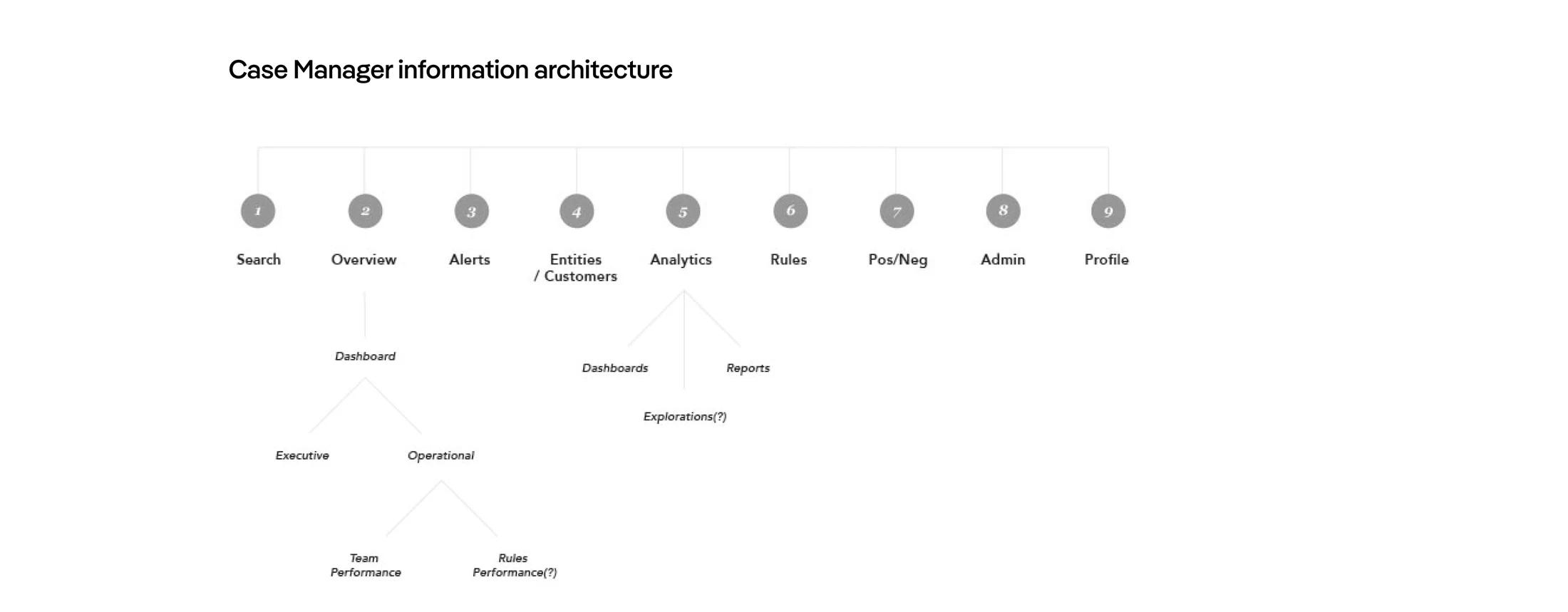
Case Manager needed a structure analysts could hold in their head: nine sections, from Search and Overview to Rules and Admin, mapped and tested on paper against real flows before a single screen was drawn.
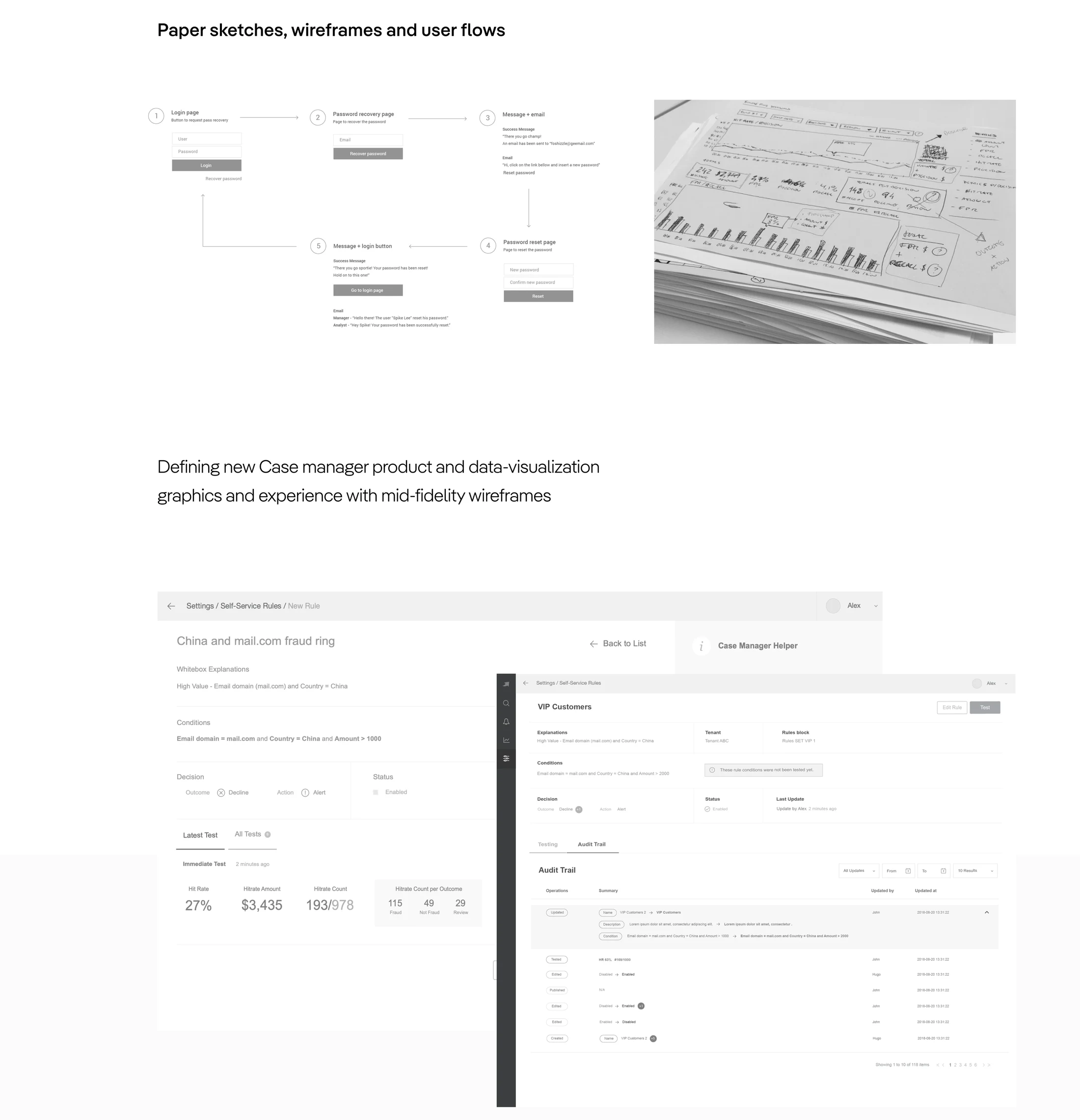
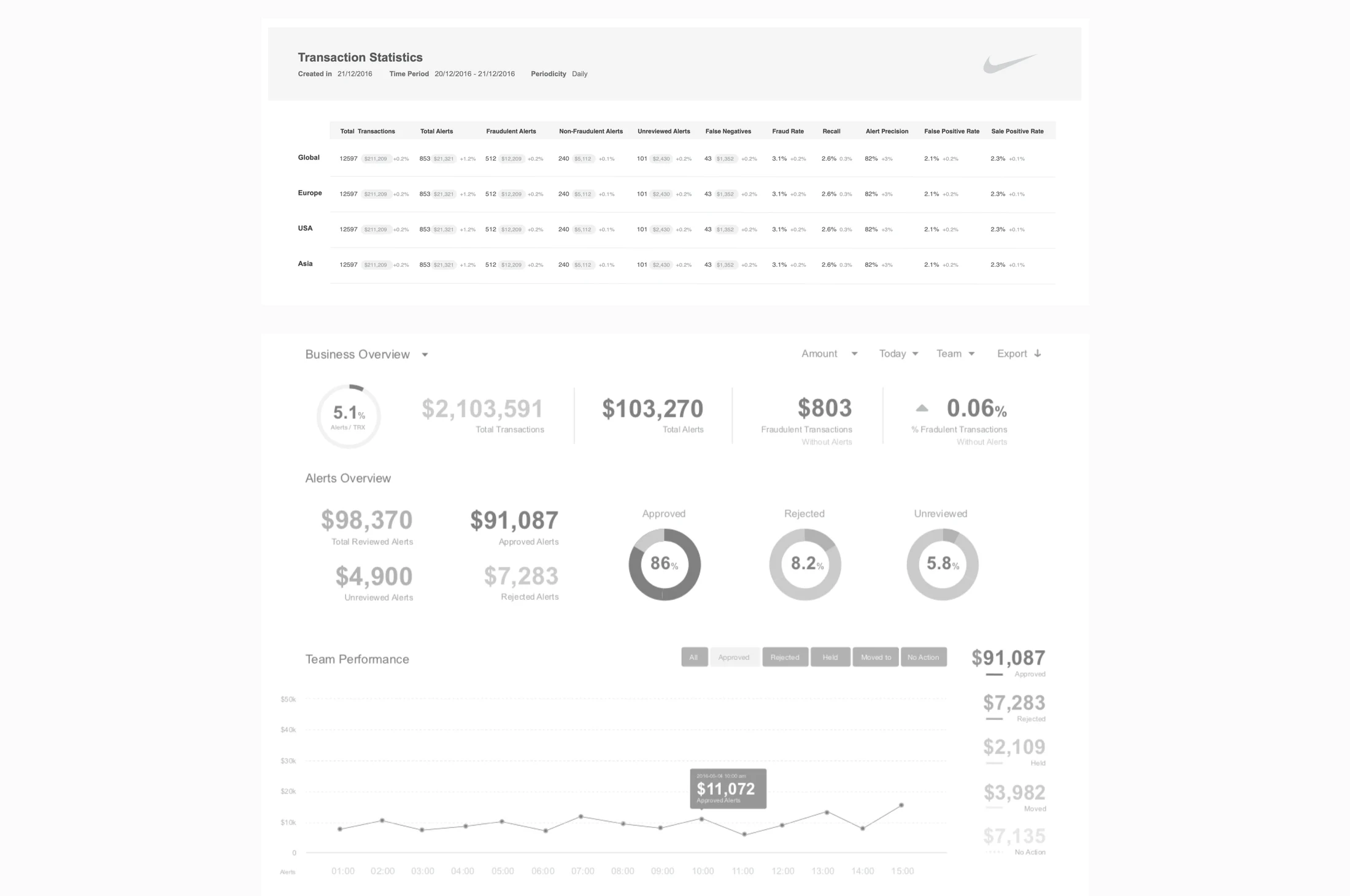
From legacy alert queue to decision workspace
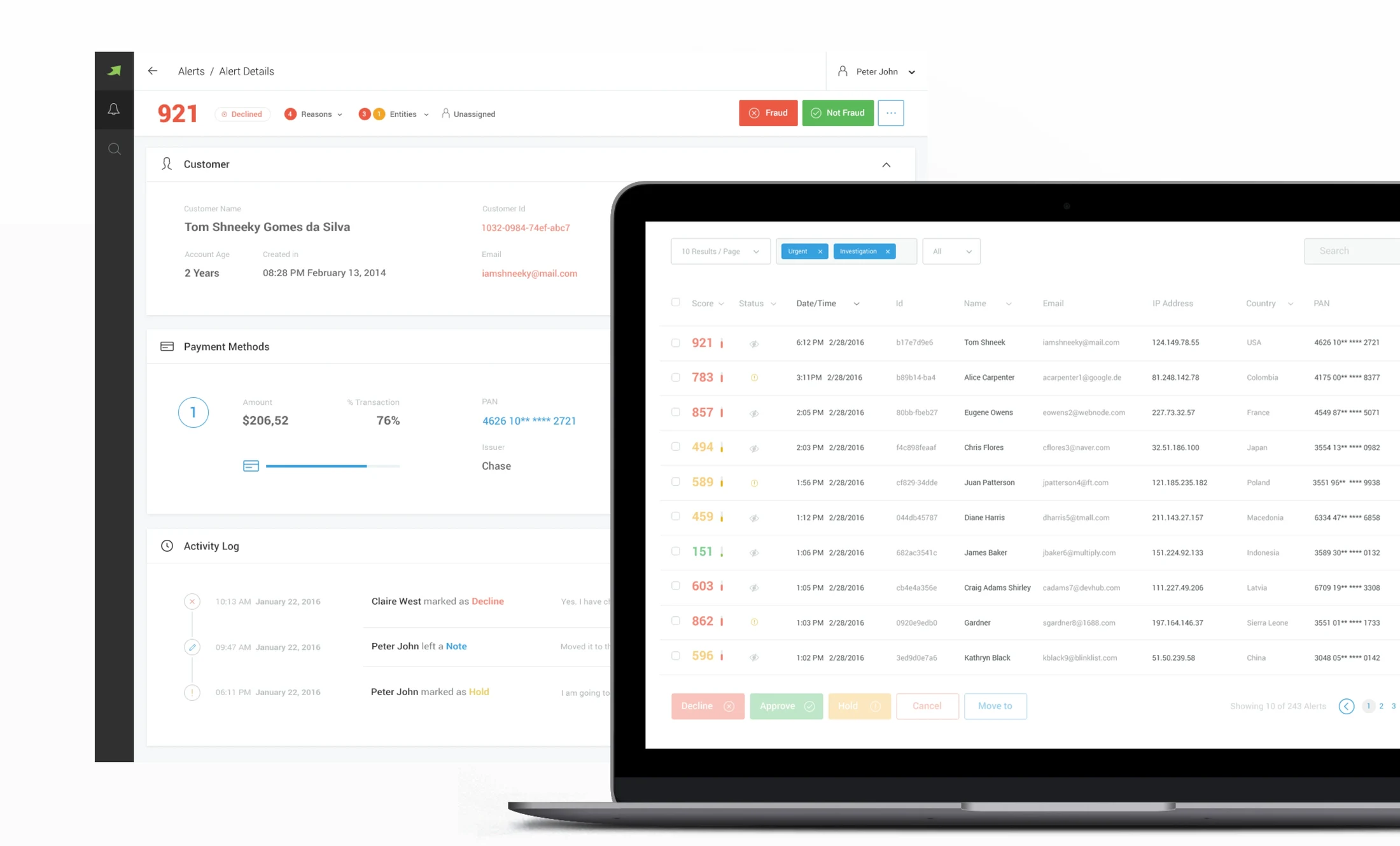
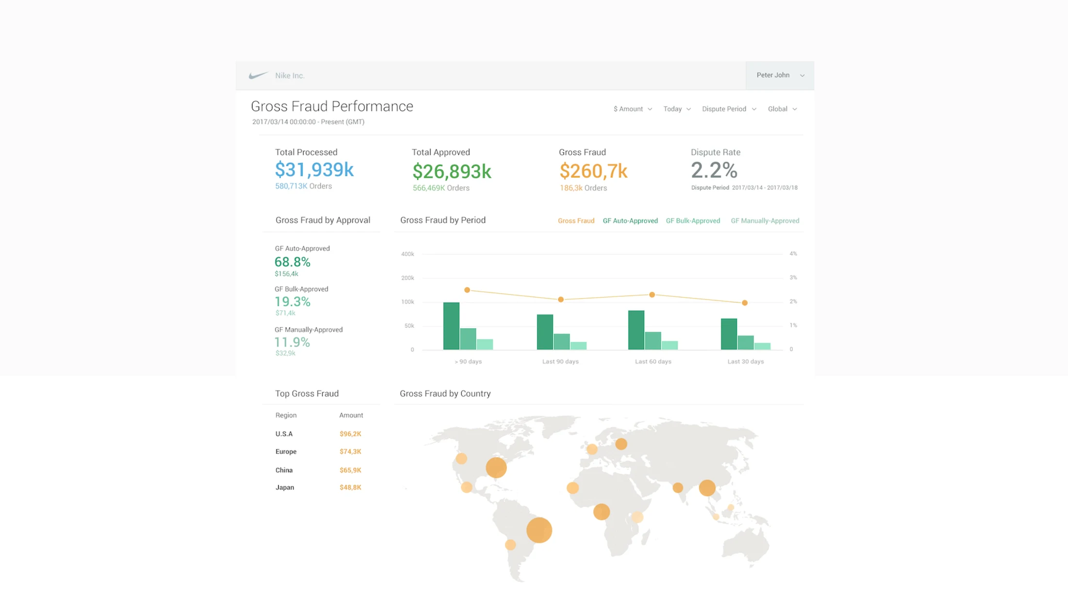
High-fidelity screens replaced the legacy Alert Manager one workflow at a time, each tested through moderated sessions, SUS and attrakdiff. Signal throughout the build, not just at the end.
The interface followed the analyst's decision process, not the data model. Insights translated ML output into a form compliance could read and trust: specific enough to be meaningful, honest enough not to overstate certainty.
Case Manager: evaluative research
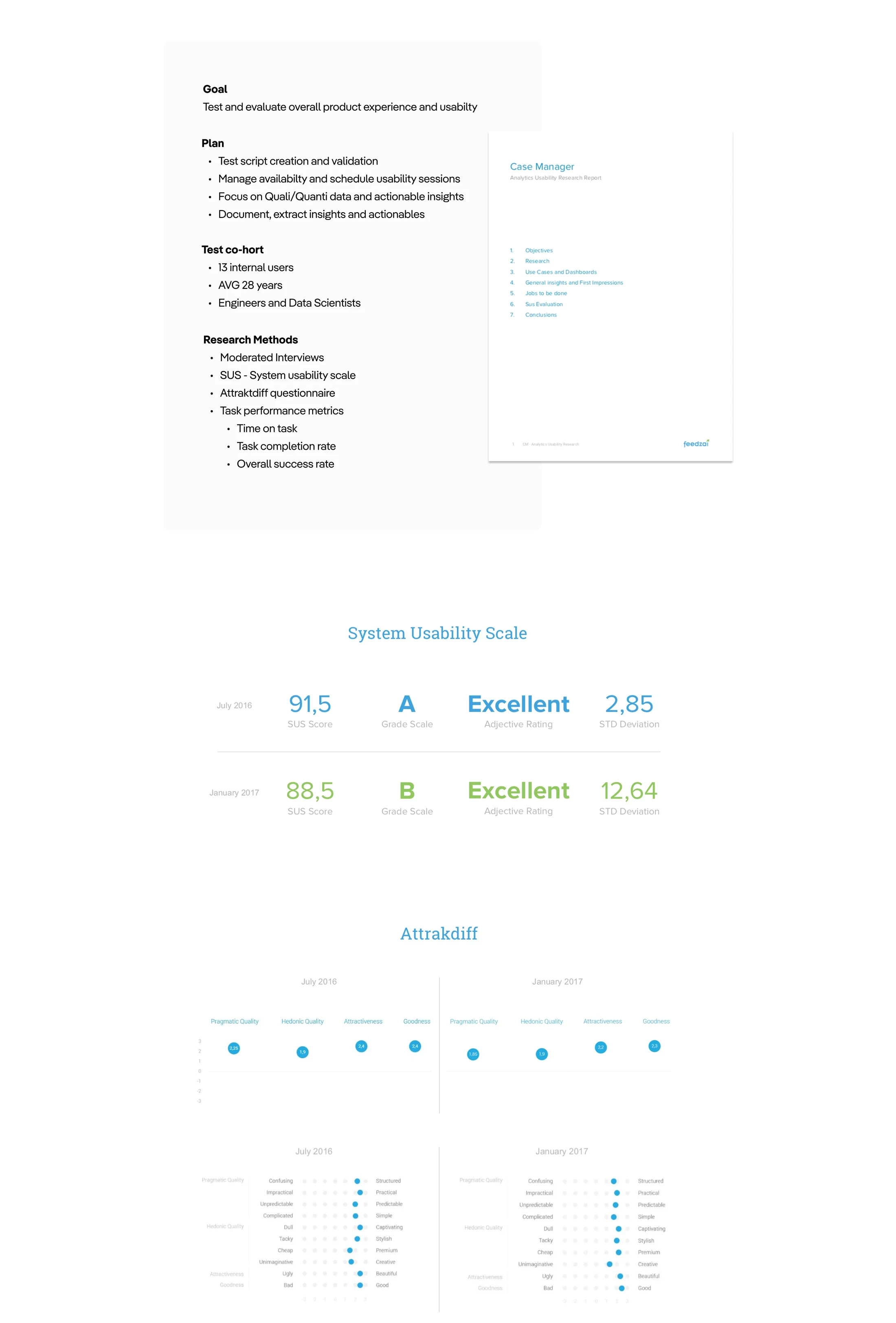
Problem. After the formative work, we needed to evaluate usability, not assume it.
Solution. Recurring usability tests with a fixed internal cohort: moderated interviews, task success metrics, SUS and attrakdiff scores.
Usability testing sessions (July 2016 + January 2017)
Three calls that shaped the outcome
Design the AI as a collaborator, not an authority
The model score was visible, never the headline. Analysts saw the evidence first. They caught model errors a more automated interface would have missed.
Audit trail as a design constraint, not an afterthought
Every decision here had regulatory weight. Building the audit trail in from day one, rather than bolting on a report, shaped how every interaction was structured.
Research as a product input, not a UX deliverable
The 40+ interviews were not a slide in a deck. They fed prioritisation, architecture and interaction patterns directly.
Components, documentation and academy
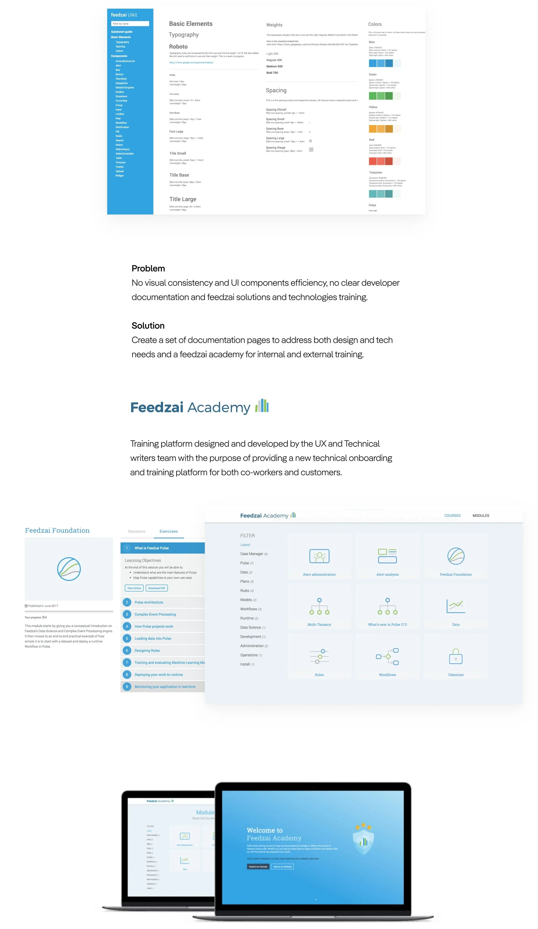
Scaling the team meant documenting the system: a UI kit, and a Feedzai Academy training platform built with the technical writing team.
Products that analysts trusted
In a domain where bad decisions carry real financial consequences, trust was the only measure that mattered. Case Manager and Insights became defining products in Feedzai's commercial expansion.
What this changed
Feedzai is where I first designed alongside machine learning rather than in front of it. Making opaque model output legible without eroding human judgment is a problem I have carried ever since.
The model score was never the headline. Evidence first, then the model's assessment.